Monday, May 30, 2011

Journal #15: Product Design

Something that my mom recently introduced me to was Scentsy products that are GREAT for dorms because they provide the scents that candles give without needing a fire! Since candles aren't allowed in dorms because they are a fire hazard, Scentsy sells wickless wax and little melting pots that are electric. Pretty much there is a little tray that you put the wax on, and then the lightbulb in the pot underneath it will provide heat and melt the wax, thus giving off a yummy scent!


I like the product designs because Scentsy provides 60+ different styles of pots and plug-ins so there is a design for everyone! I took a picture of my mom's because mine is still in the mail, but you can still see how nice the designs on these pots are. They look just like little decorations, so you can place them on mantles, bookcases, shelves, etc.

Journal #14: Papyrus- Good or Bad?

So I looked around Chatan and Naha (two cities over here in Okinawa) and I couldn't find a single example of Papyrus text anywhere. Maybe the Japanese just aren't as fond of it as Americans are?
It wasn't until I was looking up a line of backpacks that are only made in Japan that I actually saw Papyrus being used for something Japanese- a website ( http://nanamica.com/ ).
I even tried looking in magazines and newspapers, but I guess that font is pretty hard to apply to kanji because I didn't find it there either.
What I did notice is that Japanese people favor really cartoonish, bubble-letters...you know, the kind that were popular in like 6th grade.
I guess I would say that this is a good thing. NOT that they have bubble letters everywhere (aside from corporate buildings, where they use plain, straight text), but that there isn't a heavy use of the Papyrus font here. I was never a fan of Papyrus, it was always too thin for my liking.. But I am definitely going to look out for it once I get back to school, I never noticed how much it was used!

Thursday, May 26, 2011

Journal #12: Handwritten


For the handwriting assignment, I found this Dior makeup ad. The "be Iconic" phrase is scribbled in pink lipstick, the same hue as the lipstick in Kate Moss' hand. I think the handwritten script works in this case because the product is supposed to be so great that "Icons" like Kate Moss (who is one of the most recognized names in the modeling industry to date) will use it. The fact that the color of the writing matches the lipstick makes it look like Kate Moss wrote it as an afterthought to the original "Dior Addict" title. Since she herself is so influential, it is as if she is telling the women all over the world that they too can be as much of an icon as she is if they use the Dior Addict lipstick.

Journal #11: Myth


Connotative Value: This advertisement is definitely appealing to women by using a slender, attractive model and using the word "skinny" in the ad. Her red lipstick and oversized sun hat, along with her being in the spotlight, give her a glamorous feel, making women want to be like her and therefore fueling their desire for the product.

I think this is a myth because it appeals mostly to women, which seems to be saying that women are the only people who drink Diet Pepsi because they want to adjust their diets to help them lose weight. Diet Pepsi is not the only diet beverage to appeal to women, however. Most of the ads for diet drinks appeal to women because of the popular relation between females and diet fads. This is a myth that has been accepted into society since women are not the only sex to drink diet soft drinks. I have seen many guys drink Diet Coke, further proving that diet drinks are for anyone.

Journal #10: Metaphor


In this Sony headphone advertisement, the company is trying to get the message across that their headphones are the best at blocking all outside noise. Megaphones are extremely loud, and always used when someone wants to get their voice heard in audio-impared situations. The megaphone kid is used as a metaphor for the worst noise imaginable; the most impossible to ignore. The woman is sitting directly in front of the megaphone kid, looking calmly asleep, headphones over her ears. The picture is trying to say that even though there is an obnoxious noise behind the woman, she can still enjoy her music without interruption thanks to the amazing Sony headphones. I think this is a successful metaphor because the message of the advertisement is easy to understand.

Journal #9: Logos and Color Meaning

Logo One: Android
The Android robot has been becoming more and more popular due to phone companies like Sprint and Verizon using Android as their operating system of choice. The company has copyrighted their own color, "Android Green" which is hue #A4C639. Since the software was purchased by Google at the peak of the Go Green era, I think the light, kelly green is a fitting color. Because of the save-the-Earth movement, people are more attracted to any green because of the association it has with a healthier, eco-friendly lifestyle change.


Logo Two: Pepsi
The Pepsi-Cola logo is known worldwide, due to the successful taste of the soda which it represents. The success of the logo however, might also be due to the color pair chosen to represent the beverage. Pepsi did not create their own colors (no Pepsi-red or Pepsi-blue) like most companies choose to do (Tiffany & Co., Android), but perhaps they didn't need to. Blue and red are 2/3 of the primary color trio, so they are highly recognizeable and commonly used together. With the white "smile" used inbetween the two colors, it brings sort of a patriotic-American feel to the logo, and is perhaps why it took off so quickly in the U.S.

Logo Three: Gatorade
Gatorade has always been recognized due to their bright orange lightning bolt. It stands out so well against the darker green font, and is probably because orange and green naturally go together as part of a triadic color harmony (Gatorade left out the purple). The orange and green combo isn't an unusual pairing for the sports drink however, because Gatorade was first invented in 1965 at the University of Florida, home of the Gators football team. Rather than having the blue and orange like the team uniforms, Gatorade chose to incorporate the green color of the mascot. Since people could relate the drink to its birth place, the color harmony chosen by the company was successful.

Wednesday, May 25, 2011

Journal #8: Where's that copy of Emoticons Illustrated?


  • Angry (RED): Two of the pictures I chose were of people arguing: the two girls and then the silhouettes. Most of the time people who argue like that are pretty angry at each other. The upper-left picture of the woman screaming also reminds me of anger because of the expression on her face, more specifically, how her brows are down and nose is scrunched. I associate the sneering man with anger because...well, when you sneer you usally have some sort of negative, upset feeling towards something. The pouting child looks like a kid who hasn't gotten her way and is about to throw a temper tantrum.
  • Scared (GREY): The man in the upper-right corner has a stunned, frightened expression on his face, which said "scared" to me. The little girl to his immediate right definitely looks like she is afraid of whatever she is looking at. The girl with her hair flying has a freaked-out expression on her face, with her eyes bugged out and everything. The brunette woman next to her has more of a subtle, calm expression of fright. It is more timid and nervously scared than the other pictures. The old man below her looks scared, but slightly confused as well.
  • Sad (BLUE): The crying woman and baby both represent sadness because, well, they are crying and look miserable so those are definitely not tears of joy. The woman on the bed and little blonde boy are both covering their face, and their body language reads emotional defeat, so they looked pretty sad to me. Lastly, the little girl with her face in the crook of her elbow seems sort of sad and disappointed.
  • Uninspired (GREEN): Whenever I am "uninspired" usually I am pretty bored as well, so I associate lack of inspiration with boredom. The man reclining with his hands on his neck seems like he's bored at the office, just waiting for time to pass until he can go home. The man with the chopsticks in his mouth is obviously bored to the point that he's goofing off in hopes to try and entertain himself. The boy leaning against the wall also looks like he has nothing to do, and by the frown on his face seems to really wish there was something to do. The two girls with their head in their hands look like they are bored to death; the one on the left with a little bit of an attitude, and the one on the right like she's about to fall asleep.
  • Joyous (YELLOW): The little boy underneath the angry silhouettes is shouting to the sky with a huge smile on his face, which is usually an action people carry out when they are extremely happy. I associate the group of friends jumping on the beach with joy because the fact that they are all together and jumping means they're probably having a great time. The boy on the right of them looks elated, like he's just been told he can have the biggest ice cream cone in the world or something. The athletic girl has just won a championship which is something extremely great to celebrate, so of course she would be filled with joy. The little girl below her has her hands clasped and eyes shut tight with a huge grin on her face, and just looked really happy to me.

Journal #7: I'm for it..wait..I mean, I'm against it!

As you can see above, for this assignment I chose cigarettes as my topic. Since we could only use the object in question to try and display a stance on it, I have drawn an array of cigarettes in the shape of lungs. The ash coming off of the cigarettes spills into the "lungs" and is supposed to represent the pollution one would take into their body if they smoked.

Monday, May 23, 2011

Journal #5: Our Janitor Does Not Look Like That!

Boys Bathroom

Girls Bathroom

Fire Extinguisher

Janitor's Closet

Executive Washroom

Parking Garage

Exit

So for this assignment we had to "reinvent" the icons for certain signs by "adding art to the space." There's nothing I love more in art than colors, and the use of colors that complement each other in unique ways so that is what I tried to incorporate into my new signs. We couldn't use the traditional boy/girl signs so I decided to bring in the male/female symbols as well as a mop for the janitors closet, flames for the fire extinguisher, a car for the parking garage, and a beloved ARROW for the exit sign just to make sure I incorporated something from the previous journal entry.
I tried to use different, detached shapes and create images by arranging the placement of each shape so that it was next to a corresponding one in the overall image. I also added a colorful pattern in the background of each image, so I was able to incorporate other colors. I hoped to achieve emphasis by color, making my subjects a color that would contrast with the others in the background and stand out. I guess it can also be considered anomaly in the way that with boys/girls bathroom, executive washroom, and exit, the center symbols are all solid and not broken up like the parking garage, fire extinguisher, and janitor's closet signs.

Journal #4: Arrow Heaven


For this week’s assignment, I was pretty happy that we actually got to go out and take some pictures rather than drawing something because I’m not very good at drawing, I’m better at composing digitally, preferably on a computer or tablet. I was going out into town with my family and was going to take some pictures for the icons/symbols assignment (Journal 3) and so I decided to knock two birds out with one stone and take pictures of the arrows I could find as well. It wasn’t until this Journal entry forced me to look for all of the arrows used in signs and such that I realized just how much people rely on arrows.
Much like Phil Patton, author of the article “Setting Sights on the Arrow,” once I started looking for arrows, I noticed them everywhere! Not just on the street signs or on the roads, but in parking areas, for sale as house décor, on restaurant roofs. Even now as I type this, I see the up, down, and side arrows as well as the arrows on the tab, shift, and enter keys. Patton was right, arrows are everywhere. As human beings I think it is in our nature to look for those arrows, both metaphorical and in plain sight, to tell us where to go in life and how to do something when we’re lost.
This is how I started to find my arrows in the first place: we were lost. Well, not lost. We had been driving to Chatan for a few minutes and accidentally took the wrong back street. Anyways, there I was, looking for some sort of directional symbol to tell me how to get back to the main street. Soon I found the signs, as well as some on the road that I thought would be good to get. When we were looking for parking, there was another arrow: “IN” it was labeled. So we parked and walked around some, and that’s when I started finding the more interesting arrows. No little side-tails, just straight, thick blocks with sharp tips. Some were made out of multiple wood panels; one was made of an iron fence-like material. No matter what each arrow was made of, they were all designed to catch someone’s eye…and they did. I don’t know if it was because of composition or the fact that they were all arrows. We all seem to naturally look for them anyways, and if we’re not looking for them then we look at them when they are there.
The arrows on the scroll bar, next to my "Post Options" link below this text box. To go back to a previous internet page, or forward to one I have previously returned from, there are more arrows. Internet Explorer-blue, and waiting for me to click on them. The refresh key at the top of the screen has two arrows, each facing in a different direction, yet still beside each other. If I want to see the hidden icons on my taskbar or see what my print drop-screen looks like, there are more arrows.
In total I counted 34 arrows currently on my computer screen. 34! There is an arrow for almost every button, providing drop-down menus or directional aid. Nonetheless, I'm sure I would need these arrows. Take away half of them and yes, people would be lost for a little while. Companies would have to find different icons for some buttons. This just further proves the point of Patton, with my strong agreement: arrows are everywhere. People need them, people want them, people recognize them.

Journal #3: Symbols All Around You

Theme: Icons and Symbols when used next to company titles/brands.

This week is my first week here with my family and I haven’t really been to this part of Japan for a great length of time before, so I asked them to take me around the downtown Chatan area so I could familiarize myself with what was closest to where we live. This was also a perfect opportunity to look around at some shops which I thought would be a great opportunity to find some icons and symbols because Okinawans are very quirky with their logos. Throughout the day I found the following icons:

1. Sunshine Casino crown icon: I found this while driving to Chatan and thought it was odd because the crown and ribbon were used to symbolize the “Sunshine Casino” and those two objects have nothing to do with sunshine. The colors used in the icons may however be related to the title of the casino. The yellow hue is sometimes associated with sunshine in western cultures and in Japan, the rising sun is used to symbolize the country on their flag is red. However, because the symbol has no relationship to what it is representing, I would say that this logo is arbitrary.

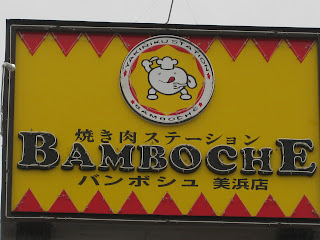
2.       Bamboche restaurant icon: This icon was on a sign at a yakiniku restaurant we went to eat at, and it captured my eye because of the cute little chef that was enclosed in the white circle. I must admit that the yellow and red directional arrows also probably helped, as they lead my eye directly to the focal point. I would say that this logo does somewhat relate to the restaurant, because it is a little chef cartoon, but it still doesn’t make known to the general public that it is a yakiniku restaurant specifically.

3.       Head Wear Store icon: This was an icon for a hat store in the Chatan market. The contrast of the highly saturated red against the black background is really captivating, and that the hat shape is framed in white makes it stand out even more against all of the white writing on the sign. The hat of course relates to the “head wear” store so I would say the addition of this icon on the sign makes it successfully communicate to shoppers.

4.       Lacoste icon: This popular brand has always been recognized by its little green alligator (or crocodile?) logo. That the icon is so simple: a green (of darker value) animal against the stark white background, really helps the company. The white allows freedom in the future for Lacoste to maybe add some more color, or even possibly a pattern as a background. Anyhow, the alligator/crocodile doesn’t really relate to the brand name so this is another arbitrary logo.

5.       Ryuku Piras icon: This was another one of the store symbols in Chatan. Instead of an animal or little cartoon, this icon was comprised of an elegant design of semi-circles using only black and white. Size was an important element of design used in this icon, as you can see with the larger vertical dividing semi-circles against the smaller semi-circles framing the top and bottom of the square.

6.       Tacorice Café icon: After seeing this icon at yet another restaurant, it became clear to me that yellow and red hues seem to be very popular in this area of Okinawa. I have yet to see the rest of the island to compare Chatan to possibly other districts. Maybe red and yellow are just popular on this island period? The circle shape is also very popular, as is symmetry. Most of the icons seem to be enclosed by some sort of thick circle, making the signs in general more symmetrical.

7.       Crocs icon: Yet another ever-popular brand in both America and Japan. The symbol for the Crocs logo is a giant “C” against a highly saturated-yet light in value-green. Again, this sign is bordered by a thick white circle.

8.       Dr. Martens icon: The symbol for the Dr. Martens sign is a yellow-green cross that is pretty large in size. Against a black background it is pretty clear that the cross is intended to be the focal point. Rather than being encased in a solid circle, the circle on this sign is made up of text. The cross symbol is often used in relation to the medical field, which is accurate for this “Dr.’s” sign.

9.       Blue Seal icon: This logo is somewhat refreshing as it introduces a hue that I have not yet seen in any signs around Chatan: blue! Blue is often linked with the cold, and this perfectly relates to the sign seeing as Blue Seal is an ice cream company. The icon is a little confusing however, the white shapes in the background combined with the ribbon on which the text is placed are supposed to create an “f” shape. I have no idea what the “f” is supposed to represent, there is no “f” in Blue Seal, and it has nothing to do with ice cream.

10.   Don Quixote windmill icon: This sign was again found in the shopping area of Chatan, but it caught my eye because of such an unusal choice of icon. It wasn’t until I read that the store’s name was “Don Quixote,” that the windmill made sense. Almost every copy of the story Don Quixote that I’ve read has been illustrated with a windmill in the background of the characters. The windmill does relate to the name of the store, but it doesn’t relate to what the store is selling (random secondhand items).

11.   Fire truck icon: This icon was found painted on a manhole in the middle of the street. What I found funny was that even signs on the STREET had the popular combination of yellow and red hues! And more: it was in the shape of a circle! I couldn’t believe this so I thought I had to add this particular icon the group I was assembling.

12.   Tea Time icon: This coffee mug icon I found when walking by a little café near the shopping district. I think it’s perfect for the sign, because it relates and represents what it is meant to symbolize.

13.   Nathan’s Famous icon: Nathan’s Famous Hot Dogs is a very popular hot dog stand in Okinawa. I don’t know if it’s big in the U.S. too, I haven’t seen one since I’ve been there, but a lot of the Americans on the base go by Nathan’s. The little hot dog icon on the tiny arrow sign represents what it is symbolizing, so the visual communication was thoroughly carried out by using it.

14.   Melon Pan icon: Melon Pan is probably the treat I miss the most from Japan, it is a sweet bread and tastes absolutely amazing when made fresh. So it only makes sense that we would stop at this fresh bread van on our little excursion. The “Happy Melon Pan” sign even has a little symbol at the top that accurately resembles the melon pan made by the owner. People across Japan recognize that symbol as melon pan, so it is fitting that it is used for this sign. The combination of the yellow and brown hues is a refreshing combination: it’s not yellow and red after all. The orientation of the sign (vertical as opposed to the more traditional horizontal sign seen so commonly) is also a nice change and adds to the uniqueness of the sign.

      15.   Hamburger Island icon: With the text of this sign throwing out so many different concepts, it makes sense that there would have to be two icons on this sign. The hamburger is fitting because it represents the “Hamburger Island” text, and the kangaroo is great because it stands for the name of the restaurant: Kangaroo Café.  The burger stays true to the Okinawan-circle concept, being both round and symmetrical. There is also the common white outlining used against the highly concentrated green and yellow hues. The Kangaroo is entirely comprised of white separated shapes, which is more subdued and allows the hamburger to remain the initial focal point of the sign.

Monday, May 16, 2011

Journal #1: Who Are You?

One

I chose this picture to most accurately portray myself because of the message it sends about culture barriers. Living back in America after so long has really sent me into quite a culture shock. While I am accustomed to being polite, well-mannered, and just plain respectful to people (since that is the Japanese way- "treat others the way you want to be treated"), I found that a lot of the people I have met in the U.S. are standoffish, blunt, and do things solely for self gain. It was a rude awakening, and I had to adjust very quickly, since my family is still stuck in Japan for the next two-three years. I'm still not sure if I have adjusted completely, but going to college on my own has definitely made me stronger as an individual, and has helped me gain more knowledge about who I am and where that can take me and my career as a graphic designer in the future.

Two

I chose this picture to portray how I thought other people would define me because in a nutshell, this is how I would guess that I looked to other people: busy. I am always running around with a million things to do, but I am never frantic, just out of time. I like to plan things, keep a schedule, and then FOLLOW that schedule. I probably don't seem like the most adventurous person in the world, because I'm not in that generic, cliff-jumping/skydiving/rockclimbing sort of way. In my own way though, I like to think that I take risks. I'm always open to travel to new places, try random foods even if they don't look good. On one of my rare days off, I will get lost on the train and find a new city that I've never been to. But not many people see that side of me, only my close friends and family. So to others, I would say that I seem busy and constantly preoccupied.