Theme: Icons and Symbols when used next to company titles/brands.
This week is my first week here with my family and I haven’t really been to this part of Japan for a great length of time before, so I asked them to take me around the downtown Chatan area so I could familiarize myself with what was closest to where we live. This was also a perfect opportunity to look around at some shops which I thought would be a great opportunity to find some icons and symbols because Okinawans are very quirky with their logos. Throughout the day I found the following icons:
1. Sunshine Casino crown icon: I found this while driving to Chatan and thought it was odd because the crown and ribbon were used to symbolize the “Sunshine Casino” and those two objects have nothing to do with sunshine. The colors used in the icons may however be related to the title of the casino. The yellow hue is sometimes associated with sunshine in western cultures and in Japan, the rising sun is used to symbolize the country on their flag is red. However, because the symbol has no relationship to what it is representing, I would say that this logo is arbitrary.
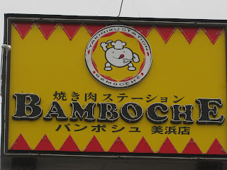
2. Bamboche restaurant icon: This icon was on a sign at a yakiniku restaurant we went to eat at, and it captured my eye because of the cute little chef that was enclosed in the white circle. I must admit that the yellow and red directional arrows also probably helped, as they lead my eye directly to the focal point. I would say that this logo does somewhat relate to the restaurant, because it is a little chef cartoon, but it still doesn’t make known to the general public that it is a yakiniku restaurant specifically.
3. Head Wear Store icon: This was an icon for a hat store in the Chatan market. The contrast of the highly saturated red against the black background is really captivating, and that the hat shape is framed in white makes it stand out even more against all of the white writing on the sign. The hat of course relates to the “head wear” store so I would say the addition of this icon on the sign makes it successfully communicate to shoppers.
4. Lacoste icon: This popular brand has always been recognized by its little green alligator (or crocodile?) logo. That the icon is so simple: a green (of darker value) animal against the stark white background, really helps the company. The white allows freedom in the future for Lacoste to maybe add some more color, or even possibly a pattern as a background. Anyhow, the alligator/crocodile doesn’t really relate to the brand name so this is another arbitrary logo.
5. Ryuku Piras icon: This was another one of the store symbols in Chatan. Instead of an animal or little cartoon, this icon was comprised of an elegant design of semi-circles using only black and white. Size was an important element of design used in this icon, as you can see with the larger vertical dividing semi-circles against the smaller semi-circles framing the top and bottom of the square.
6. Tacorice Café icon: After seeing this icon at yet another restaurant, it became clear to me that yellow and red hues seem to be very popular in this area of Okinawa. I have yet to see the rest of the island to compare Chatan to possibly other districts. Maybe red and yellow are just popular on this island period? The circle shape is also very popular, as is symmetry. Most of the icons seem to be enclosed by some sort of thick circle, making the signs in general more symmetrical.
7. Crocs icon: Yet another ever-popular brand in both America and Japan. The symbol for the Crocs logo is a giant “C” against a highly saturated-yet light in value-green. Again, this sign is bordered by a thick white circle.
8. Dr. Martens icon: The symbol for the Dr. Martens sign is a yellow-green cross that is pretty large in size. Against a black background it is pretty clear that the cross is intended to be the focal point. Rather than being encased in a solid circle, the circle on this sign is made up of text. The cross symbol is often used in relation to the medical field, which is accurate for this “Dr.’s” sign.
9. Blue Seal icon: This logo is somewhat refreshing as it introduces a hue that I have not yet seen in any signs around Chatan: blue! Blue is often linked with the cold, and this perfectly relates to the sign seeing as Blue Seal is an ice cream company. The icon is a little confusing however, the white shapes in the background combined with the ribbon on which the text is placed are supposed to create an “f” shape. I have no idea what the “f” is supposed to represent, there is no “f” in Blue Seal, and it has nothing to do with ice cream.
10. Don Quixote windmill icon: This sign was again found in the shopping area of Chatan, but it caught my eye because of such an unusal choice of icon. It wasn’t until I read that the store’s name was “Don Quixote,” that the windmill made sense. Almost every copy of the story Don Quixote that I’ve read has been illustrated with a windmill in the background of the characters. The windmill does relate to the name of the store, but it doesn’t relate to what the store is selling (random secondhand items).
11. Fire truck icon: This icon was found painted on a manhole in the middle of the street. What I found funny was that even signs on the STREET had the popular combination of yellow and red hues! And more: it was in the shape of a circle! I couldn’t believe this so I thought I had to add this particular icon the group I was assembling.
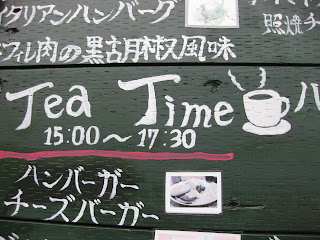
12. Tea Time icon: This coffee mug icon I found when walking by a little café near the shopping district. I think it’s perfect for the sign, because it relates and represents what it is meant to symbolize.
13. Nathan’s Famous icon: Nathan’s Famous Hot Dogs is a very popular hot dog stand in Okinawa. I don’t know if it’s big in the U.S. too, I haven’t seen one since I’ve been there, but a lot of the Americans on the base go by Nathan’s. The little hot dog icon on the tiny arrow sign represents what it is symbolizing, so the visual communication was thoroughly carried out by using it.
14. Melon Pan icon: Melon Pan is probably the treat I miss the most from Japan, it is a sweet bread and tastes absolutely amazing when made fresh. So it only makes sense that we would stop at this fresh bread van on our little excursion. The “Happy Melon Pan” sign even has a little symbol at the top that accurately resembles the melon pan made by the owner. People across Japan recognize that symbol as melon pan, so it is fitting that it is used for this sign. The combination of the yellow and brown hues is a refreshing combination: it’s not yellow and red after all. The orientation of the sign (vertical as opposed to the more traditional horizontal sign seen so commonly) is also a nice change and adds to the uniqueness of the sign.
15. Hamburger Island icon: With the text of this sign throwing out so many different concepts, it makes sense that there would have to be two icons on this sign. The hamburger is fitting because it represents the “Hamburger Island” text, and the kangaroo is great because it stands for the name of the restaurant: Kangaroo Café. The burger stays true to the Okinawan-circle concept, being both round and symmetrical. There is also the common white outlining used against the highly concentrated green and yellow hues. The Kangaroo is entirely comprised of white separated shapes, which is more subdued and allows the hamburger to remain the initial focal point of the sign.


No comments:
Post a Comment